How to supply print ready PDF files
Creating a PDF in Adobe Indesign
Step 1
Select File >Adobe Preset >Press Quality.
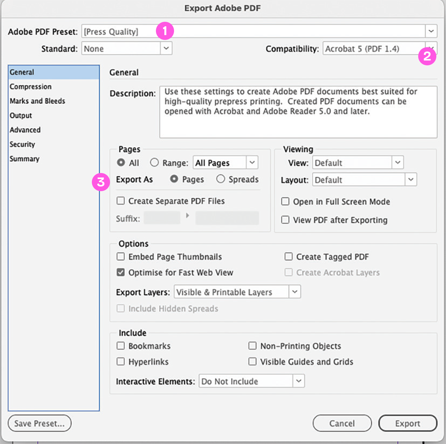
- Press Quality is selected.
- Compatibility is set to Acrobat 5 (PDF 1.4).
- Export as single pages is selected.
Step 2
Click the Marks and Bleeds tab
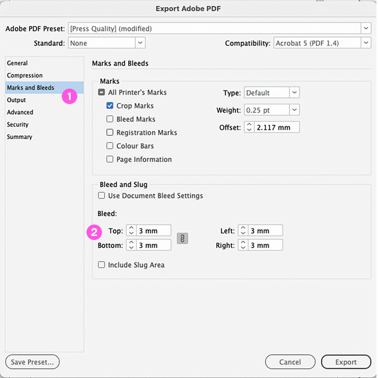
- Crop Marks is selected.
- 3mm Bleed is added on all edges.
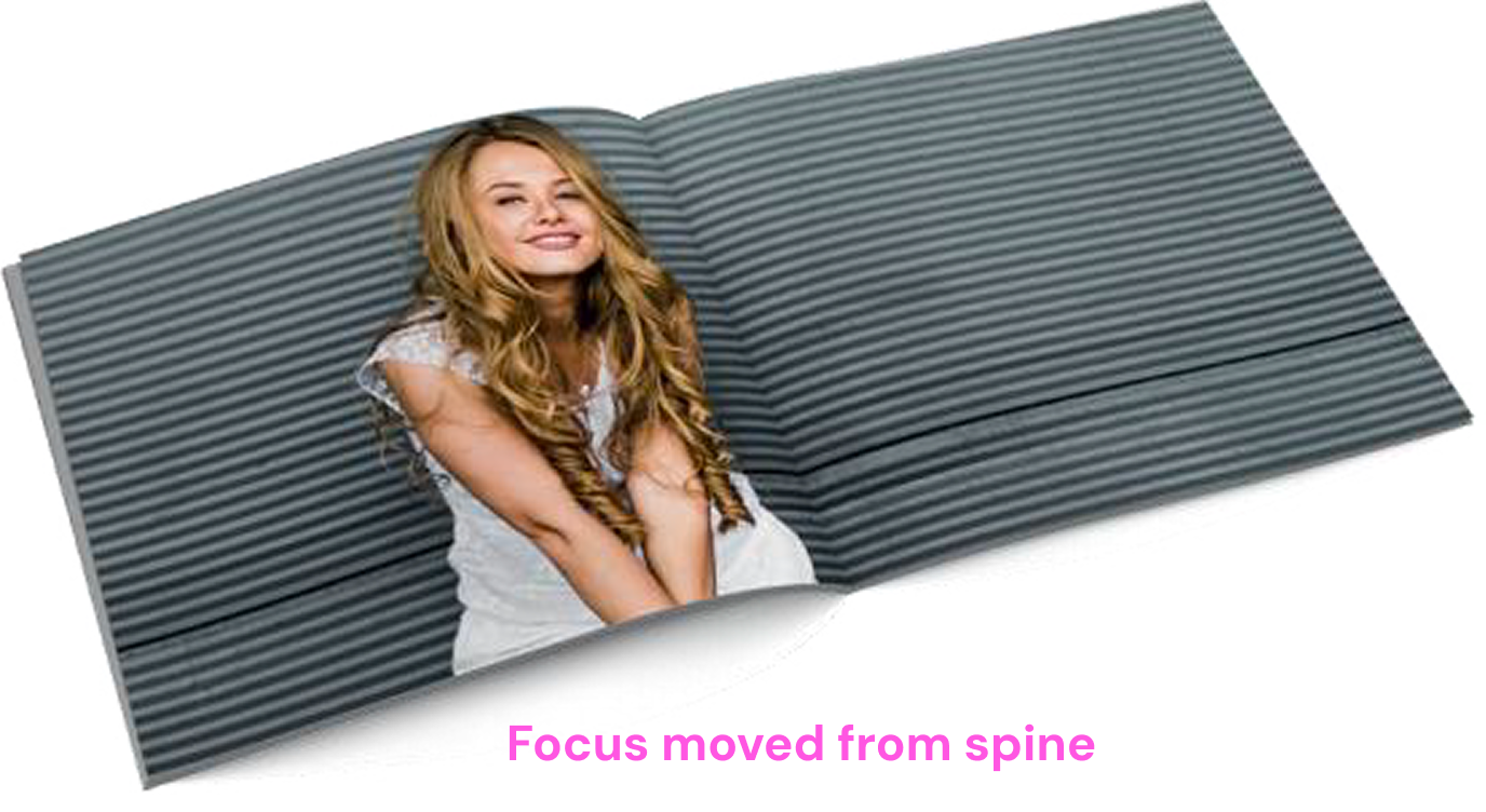
Perfect Bound Jobs
It is normally best to avoid having the focus of your image directly on or near the spine of a perfect bound book. The alignment of your read-across image is much less obvious if your eye isn’t drawn to it.
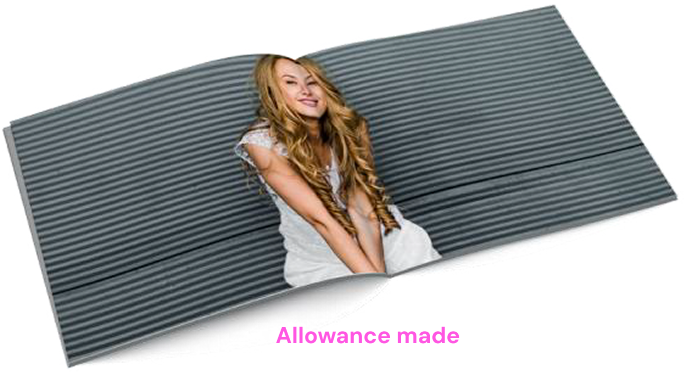
However, if your design dictates a read-across image or text we advise allowing 8mm on the inside Front Cover and 6mm on the first page of text - as shown in the images below. This will look quite strange to a designer’s eye, but it will ensure your artwork aligns more successfully.
If you have read-across pages within your text the same rules apply but please only move each page by 3mm.
Please be aware that with PUR binding the cover is drawn to the text by force and glued in place, then three edges are trimmed. This manufacturing process does have slight movement variance so any artwork with read-across pages will never be as perfect as a flat piece of print.
If your book is very bulky, or has a heavy weight cover please contact us for further advice.
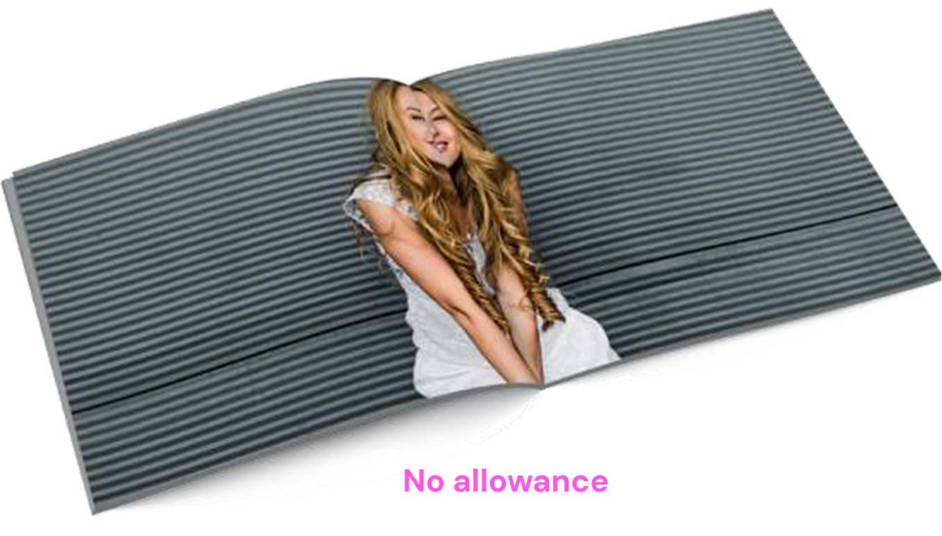
No allowance

6mm allowance

Get in touch
Products
About Press Print
How can we help
© 2025 Micropress Printers Ltd trading as Press Print (pressprint.co.uk)